In this blog I’m going to show you how you can create a frosted glass panel for your website or side project using just CSS. We will be learning this method in 2 ways.
- css
backdrop-filterproperty insetdrop-shadows You will be learning 2 hopefully new CSS concepts along the way so let’s get started.
First things First
Get the template ready. Just make a div as follows.
1<div class="glass frosted">2 <h1>Frosted Glass</h1>3</div>
Also remember to give your background a cool image wallpaper to notice the glass effect. Or you can always refer to the demo below ;)
Let’s get to business
Method 1
For this we will be using css backdrop-filter property. We will add the following css to the frosting class.
The backdrop-filter CSS property lets you apply graphical effects such as blurring or color shifting to the area behind an element. Which means it is filter but for background.
So one of the filter in css we have is blur which takes the parameter in pixels relating to the intensity of the blur.
1.frosted_1 {2 /* Frosted glass affect */3 -webkit-backdrop-filter: blur(8px);4 backdrop-filter: blur(8px);5}
Note - The extra css with -webkit- appended is for Safari and similar browsers which use webkit engine.
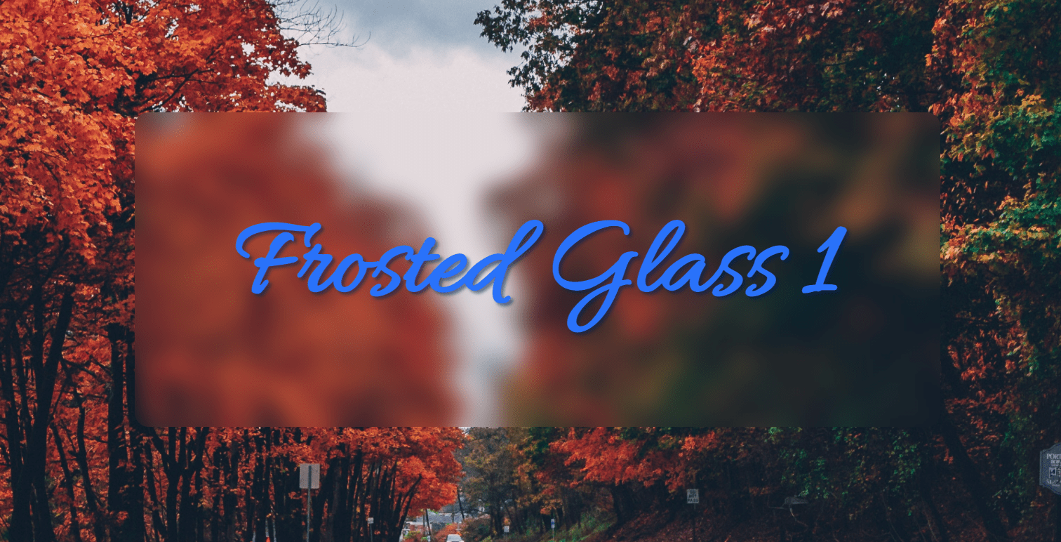
So how does this look? Something like this -

We can clearly see the frosty blur effect.
But something is still lacking. There is not depth among the elements so it doesn’t exactly look like a seperate surface or in our case a glass.
For that we will use another css property that is box-shadow. The box-shadowCSS property adds shadow effects around an element’s frame. So exactly how its named.
Also while we are at it we will also give the element some extra background color to make it look more realistic as a glass.
1.frosted_2 {2 /* Frosted glass affect */3 -webkit-backdrop-filter: blur(8px);4 backdrop-filter: blur(8px);56 /* Add box-shadow for more depth */7 box-shadow: 0px 10px 15px 10px rgba(0 ,0 ,0 ,0.15);8 background-color: rgba(228 ,228 ,228 ,0.10);9}
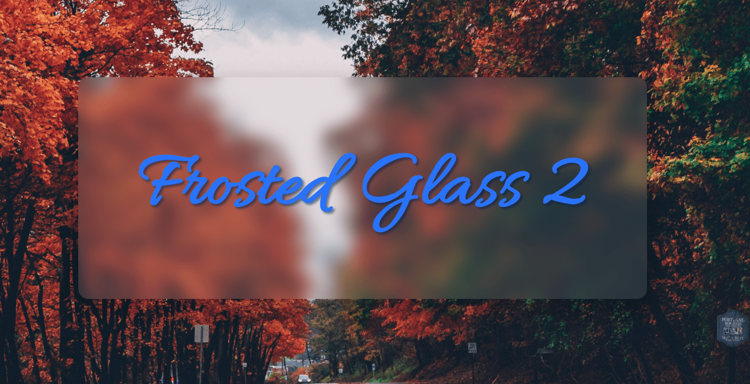
After this change our glass panel will look more realistic and way cooler. As shown below -

Method 2
This method is a little more complex than the above one but it is more widely supported in even older browsers too. So this is the tradeoff you always have to make.
Let’s begin.
So instead of backdrop-filter we will be using filter and we will be using drop-shadow filter of css. And the given filter does exactly what the name suggests so nothing to explain here. Let’s see the code and the result.
1.frosted_3 {2 filter: drop-shadow(2px 4px 6px black);3 background-color: rgba(152, 151, 151, 0.2);4}
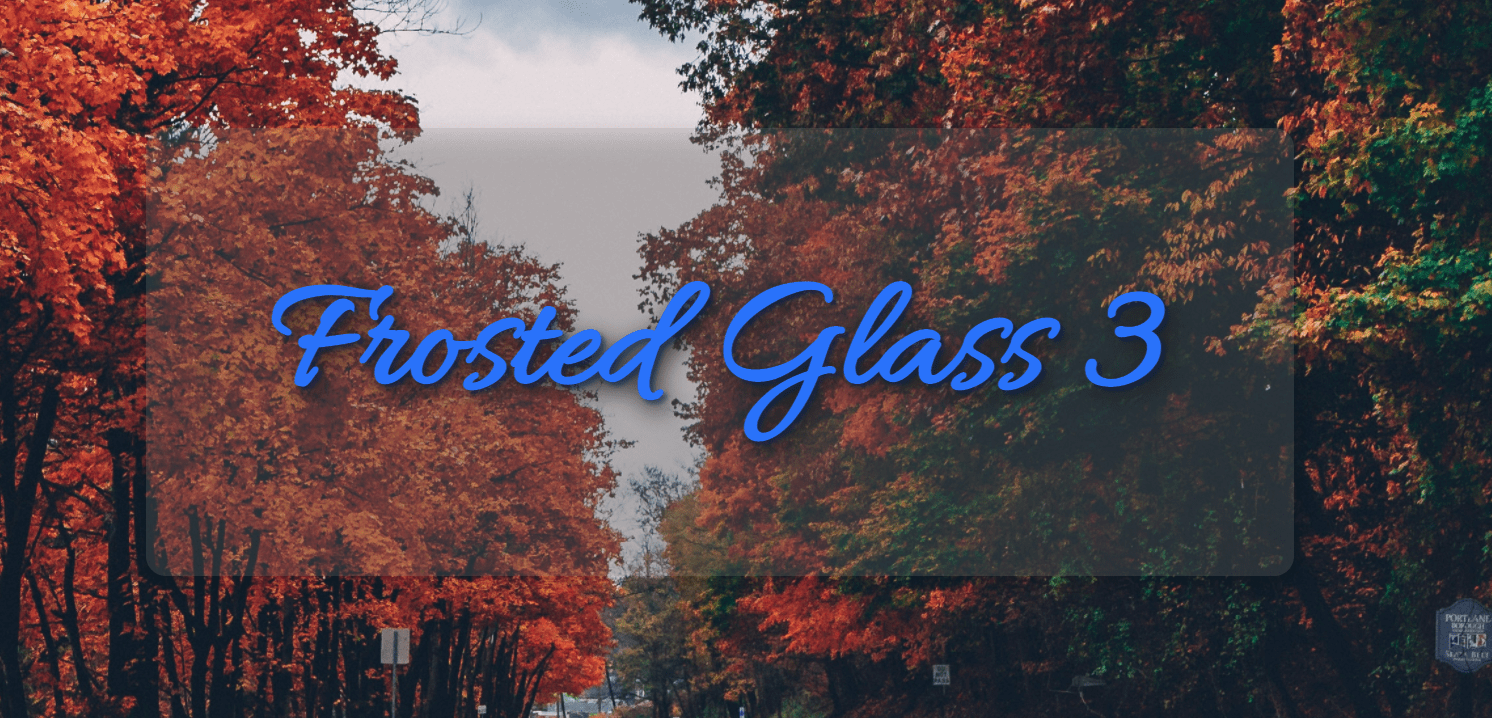
Oh and also we added some background color with opacity set to 20% just to emulate the blur effect of method 1. The result will look something like this -

Last trick up my sleeve
We are not yet done with method 2. There is another css property known as box-shadow. Which we also used above in method 1. There isa different way of using this property as seen till now.
And it is to use inset box-shadow. Which will mean the shadow will not cast outside the element but only inside itself. Creating a depth effect.
So our final CSS for method 2 will end up looking like this.
1.frosted_3 {2 filter: drop-shadow(2px 4px 6px black);3 background-color: rgba(152, 151, 151, 0.2);4 box-shadow: inset 0 0 0 200px rgb(255, 255, 255, 0.08);5}
And the result which will be a huge improvement over the last one of method 2 would look like this -

So that is it folks. That is all we have for this tutorial if you want I have setup all this code in a github repo for you. Over here -

